
2019 / UX / WEB
Digital Lab Experience
Shaping enterprise banking UX through modular design and interface clarity
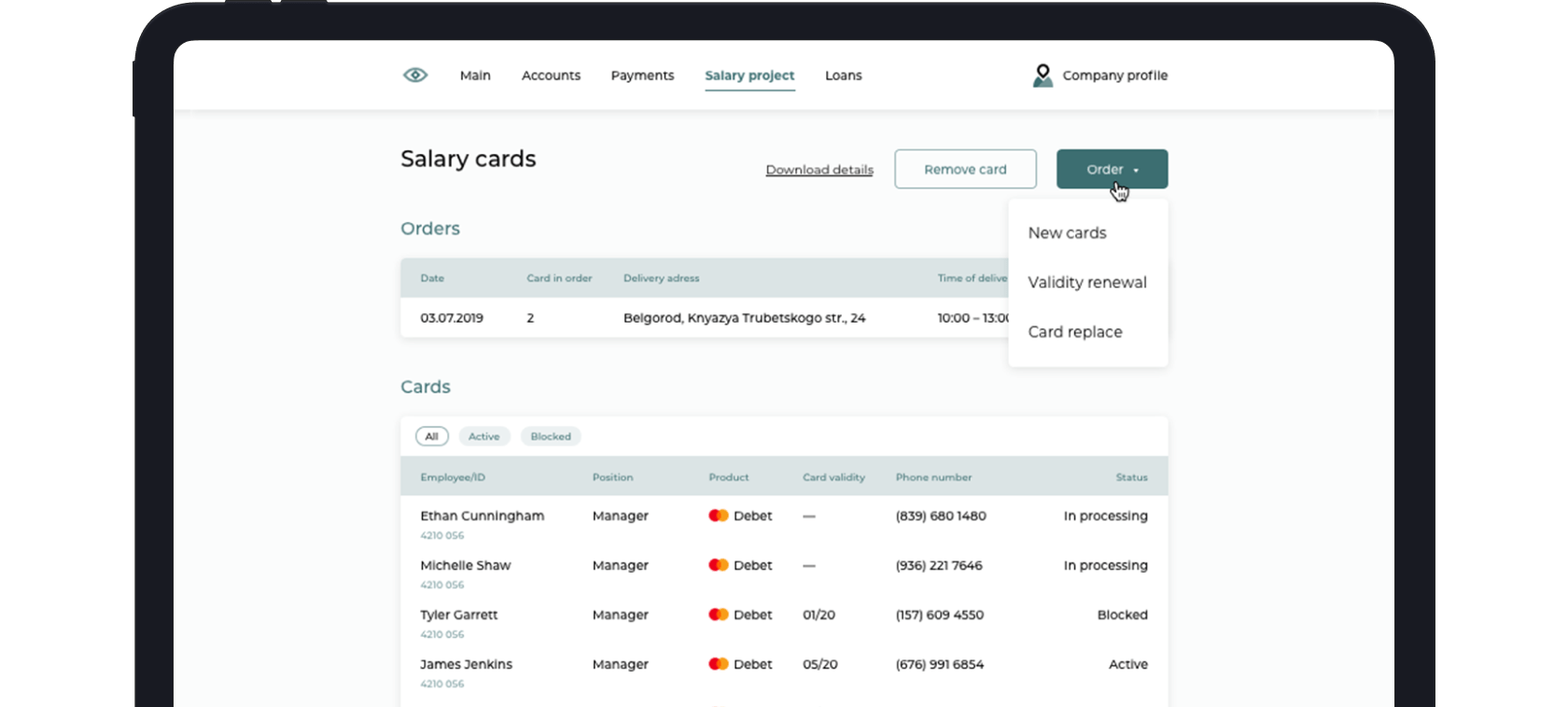
Interfaces shown have been modified to comply with NDA requirements.
Context
One of the largest banks in West Asia set out to establish a digital laboratory to accelerate the launch of new B2B products. At the time, the bank had no digital offerings for corporate clients — services were only available in branches or by phone, resulting in slow and expensive service delivery. IBM iX was engaged to support the initiative.
I joined a compact cross-functional team to prototype two key digital products from scratch: a loan management system and a salary card ordering tool. Our work spanned three months and included UX design, interface logic, and support for multilingual and multi-resolution implementation.
I joined a compact cross-functional team to prototype two key digital products from scratch: a loan management system and a salary card ordering tool. Our work spanned three months and included UX design, interface logic, and support for multilingual and multi-resolution implementation.
Approach
We collaborated closely, using digital whiteboards and prototyping tools to map journeys and test ideas in real time.
Loans
While designing the interface for active loans, it became clear that a tabular view would not work — loan products had diverse attributes that made standardization impractical.

- SolutionI proposed a card-based layout. Each loan appeared as an individual card showing relevant details. The card design followed the design system, ensuring visual consistency and simplifying development.
- For early repayment, I analyzed how customer choices affect loan conditions. The repayment screen was structured around desired outcomes and included all necessary data — loan terms, fees, and updated conditions — in a single view.

Salary cards
The goal here was to simplify the ordering process and status tracking for salary cards.
- Key changes
- Required forms were generated automatically based on the number and type of cards requested.
- Orders could be saved and resumed later.
- Instead of using technical labels for order types, I suggested naming them by customer intent, improving clarity and reducing interface complexity.
Impact
Interfaces were designed in three languages and for three screen resolutions, with adaptable layouts and text integration into the existing design system.
-
-
1.5×
Increase
in CSI* across both products
-
2×
Faster
salary card issuance process
-
+3%
Growth
in the loan product client base
*Customer Satisfaction Index
Spark
When I saw inconsistencies in the icon set, I volunteered to redesign it.

- Icon packI defined grid rules, unified style, and created missing icons using brand shapes and typography.
- Icon guideThe guide included instructions on grid usage, line weight, symmetry, and visual balance. I also documented best practices, “do’s and don’ts,” and construction logic — helping the team create future icons consistently.
More projects
-
 Product design: Updating communicationImproving how the interface communicates with users
 -
 Seamless ID and banking accessRemote-first banking service: from identity to agreement in a single flow
 -
 Seamless ID and banking access: Case StudyExploring the design process behind an online banking service
 -
 From steel boxes to digital accessDesigning trust into the experience of renting a safe deposit box
 -
-
 Branding for digital channelsStrengthening studio identity through adapting branding for digital channels
