Product Design: Communication Layer
- Role: UX/Product Designer
- Timeline: Several months
- Scope: System communication, notification logic, modal cleanup
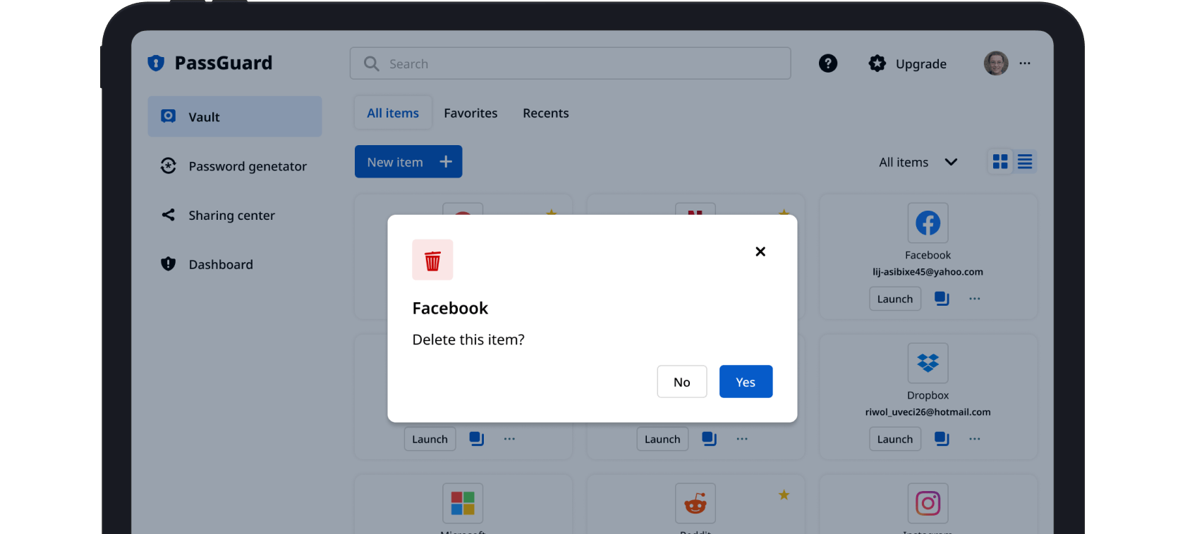
Interfaces shown have been modified to comply with NDA requirements.
What was needed:
A running product needed clarity in how it “talked” to users — from toasts and banners to deletion confirmations and upgrade prompts. Existing components were inconsistent, visually noisy, and often misused.
What I did:
- Mapped all notification and messaging types
- Redesigned key components: toast messages, banners, modal dialogs
- Ran surveys to compare modal types and icon choices
- Proposed taxonomy change (Error → Danger) to align logic with color tokens
- Removed unnecessary icons to reduce distraction
- Helped define cross-system patterns and integrated them into the design system
Result:
Improved visual rhythm and clarity. Helped the team ship consistent feedback mechanics that reduced user confusion and increased UI trust. All decisions backed by user testing and added to the knowledge base.
New toast component: reduced noise, improved consistency across the system


Modal dialogs types

Danger modal: aligned icon & tone

Upgrading to a paid account and submitting feedback features